
Many of these problems are a result of poor conversion practices and can be improved by conversion rate optimization.

Landing pages are built with a campaign specific goal in mind and guide users to a singular call-to-action in order to maximize campaign ROI. By designing a page that is directly linked to your search engine marketing or social media ad campaign, landing pages are able to match the messaging and imagery of your ads creating a seamless user experience from ad click to conversion. Read More

Here at the Marketing Garage, we are believers that the secret to effective internet marketing is to always be learning, testing, and tuning. It’s important to build off of your success and to keep the best while fixing the rest.
Recently, we had a Toronto B2B client in the professional services industry that was looking into rebuilding their website. Although the site performance was positive, the overall look was beginning to feel dated and our client was ready to upgrade in hopes of driving more leads.
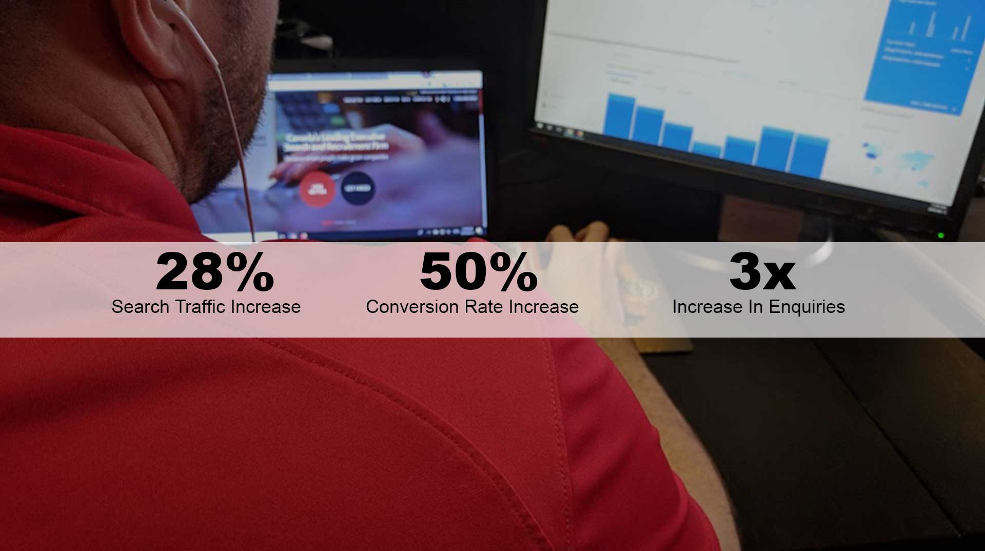
Site rebuilds can be risky. If not done properly, they can lead to a drop in Google rankings, losing all of your hard work. Instead of seeing a drop in the rankings, we were able to actually increase search traffic by 28% as well as increase the conversion rate by 50% and increase enquiries by 3x!
See how we did it here:
Read The Case Study
The website industry is ever-evolving. As trends come and go, web masters will jump onto new developments and stick to them for various reasons. Some are intrigued by the ingenuity, some the practicality, and some the performance. As a result many ideas that become staples in professional web design will turn away users who aren’t interested in the industry on a professional level.
Below are 3 popular trends you have probably seen that turn visitors off and can hinder the performance of your website.
The tried and true image slider is one of the most commonly used features on home pages across the web.
The image slider allows a designer to display multiple products and/or messages in one location. If your business offers three main services a designer goes to the logical solution of making one slide for each service and rotating them indefinitely. This will ensure users get equal exposure to each service.
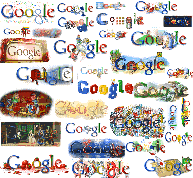
Working at a Toronto branding company, I’ve always loved the online branding power Google built through its Google Doodles. You know the…

Some people say that Google built its brand without traditional advertising.
Poppycock!
Putting aside its current use of traditional advertising to market itself…(ahem)
…Google also was smart as hell to create awareness of which search engine you were using by occassionally tweaking the presentation of its name. Along with other little proofpoints of differentiation like the speed and quantity of its results…
…this creative way of building good ol’ fashioned brand awareness and corporate identity is one of the secrets of its success. Something Yahoo, AOL, Netscape and others missed. And something that continues to be missed by even big online brands today like Facebook.
(It’s also a great example to point people to who believe “no, our logo and corporate identity is carved in stone” point. It shows when and why you can play with corporate identity can be played with.)
Now comes some facts Read More